Creating a Navigation Bar with Flexbox
Creating a navigation bar for a site used to be challenging, especially when you want a horizontal navigation bar on large screens. You’d need to do the math to split up your elements, account for padding and margin width, and then hope nobody wanted changes later.
With Flexbox widely available in browsers, creating your navigation bar involves much less code.
In this tutorial you’ll build a navigation bar with elements evenly-spaced on large screens, and vertically stacked on small screens, and you’ll build it all with minimal HTML and CSS.
Creating the HTML
Create a new HTML file called nav.html and place the following HTML skeleton in the file:
<!DOCTYPE html>
<html lang="en-US">
  <head>
    <meta charset="utf-8">
    <meta name="viewport" content="width=device-width, initial-scale=1">
    <title>My Navbar Example</title>
  </head>
  <body>

  </body>
</html>
This template defines the document’s language, the character encoding, the viewport size, so mobile devices will zoom and scale the page appropriately, and the page’s title.
In the <body> of the page, add a <nav> element that contains a few links:
<nav>
  <a href="#">Home</a>
  <a href="#">About</a>
  <a href="#">Products</a>
  <a href="#">Support</a>
</nav>
This navigation element only contains <a> tags. It does not contain an unordered list or other markup like you might have seen in other menu examples. This is all the markup you need to define your menu, as Flexbox can handle all of the alignment and styling. If you need to develop a more complex menu, with sections, submenus, and other elements, you might benefit from additional structural elements, but that’s not the case here.
Now let’s add the styles.
Styling the Menu
Styling the menu involves two steps:
- Defining the placement of elements
- Defining the appearance of elements
Start by defining the placement. The goal for this menu is that it displays vertically on small screens and horizontally on large screens. You’ll end up writing less code if you build your CSS “mobile first”; in other words, style everything for the small screen first, and then add media queries for the larger screens.
In your nav.html file, add a <style> element to the <head> section.
<head>
...
  <style>

  </style>
</head>
In a larger project, you’d use an external stylesheet with a <link> element, but for this example, keep everything in one file so you can reference it later when you’re working on your own projects.
Within the <style> section of the page, add a new definition for the nav element that defines it as a flex container, ensures its child elements are spaced apart evenly, and that the elements are stacked vertically:
nav {
  display: flex;
  justify-content: space-between;
  flex-direction: column;
}
The justify-content option ensures there’s even spacing between child elements, while flex-direction determines whether child elements are displayed vertically stacked (column), or horizontally placed (row). Stacking elements vertically by default follows the “mobile first” philosophy.
Next, add a media query that targets larger displays and defines flex-direction again, but this time using the row value:
@media only screen and (min-width: 768px) {
  nav { flex-direction: row; }
}
This media query looks for screens with a minimum width of 768 pixels. In your own projects, use your browser’s developer tools to simulate mobile devices and adjust the width and identify a width that works for you.
The flex container is defined, so the next step is to style the individual elements. The flex container settings you specified in the nav element’s style definition apply to direct child elements only. That’s one reason this code doesn’t use additional markup like bulleted lists. If you did that, you’d have to make the list the flex container instead.
Add the following style definition to evenly space your elements:
nav a{
  flex: 1;
  text-align: center;
  margin: 0.25em;
  padding: 0.25em;
}
The flex property defines how the element will shrink or grow. Using flex: 1 on all of the <a> elements makes them all take up the same size. If you wanted one of the elements to be twice as wide as the others, you’d specify one of those to use flex: 2.
text-align: center centers the text inside of each element. The margin and padding ensure there’s even spacing inside and outside of each element.
This defines the placement of the elements. Now define the appearance. Add a border around each navigation item, change the color, and remove the underline:
nav a{
  flex: 1;
  text-align: center;
  margin: 0.25em;
  padding: 0.25em;
  border: 1px solid #ddd;
  text-decoration: none;
  color: #555;
}
Your menu is complete. Your entire file should look like this:
<!DOCTYPE html>
<html lang="en-US">
  <head>
    <meta charset="utf-8">
    <meta name="viewport" content="width=device-width, initial-scale=1">
    <title>My Navbar Example</title>
    <style>
      nav {
        display: flex;
        justify-content: space-between;
        flex-direction: column;
      }

      @media only screen and (min-width: 768px) {
        nav { flex-direction: row; }
      }

      nav a{
        flex: 1;
        text-align: center;
        margin: 0.25em;
        padding: 0.25em;
        border: 1px solid #ddd;
        text-decoration: none;
        color: #555;
      }

    </style>
  </head>
  <body>
    <nav>
      <a href="#">Home</a>
      <a href="#">About</a>
      <a href="#">Products</a>
      <a href="#">Support</a>
    </nav>
  </body>
</html>
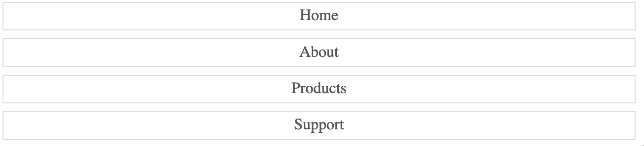
Verify that it does, and save the file. Open the file in your browser and you’ll see your horizontal navbar:

Shrink the browser window below 768 pixels and you’ll see the vertical menu:
Conclusion
In this tutorial you explored the Flexbox feature of CSS. Flexbox lets you build a navigation element with much less code than you could in the past, but you can also use it for things like image galleries, user interface panes, or other elements you need to align horizontally or vertically. You could even use it for entire layouts. Explore Flexbox and see how you can fit it in to your next project.
Like this post? Support my writing by purchasing one of my books about software development.


Thanks for reading
I don't have comments enabled on this site, but I'd love to talk with you about this article on BlueSky, Mastodon, Twitter, or LinkedIn. Follow me there and say hi.